UX / UI
Android
iOS
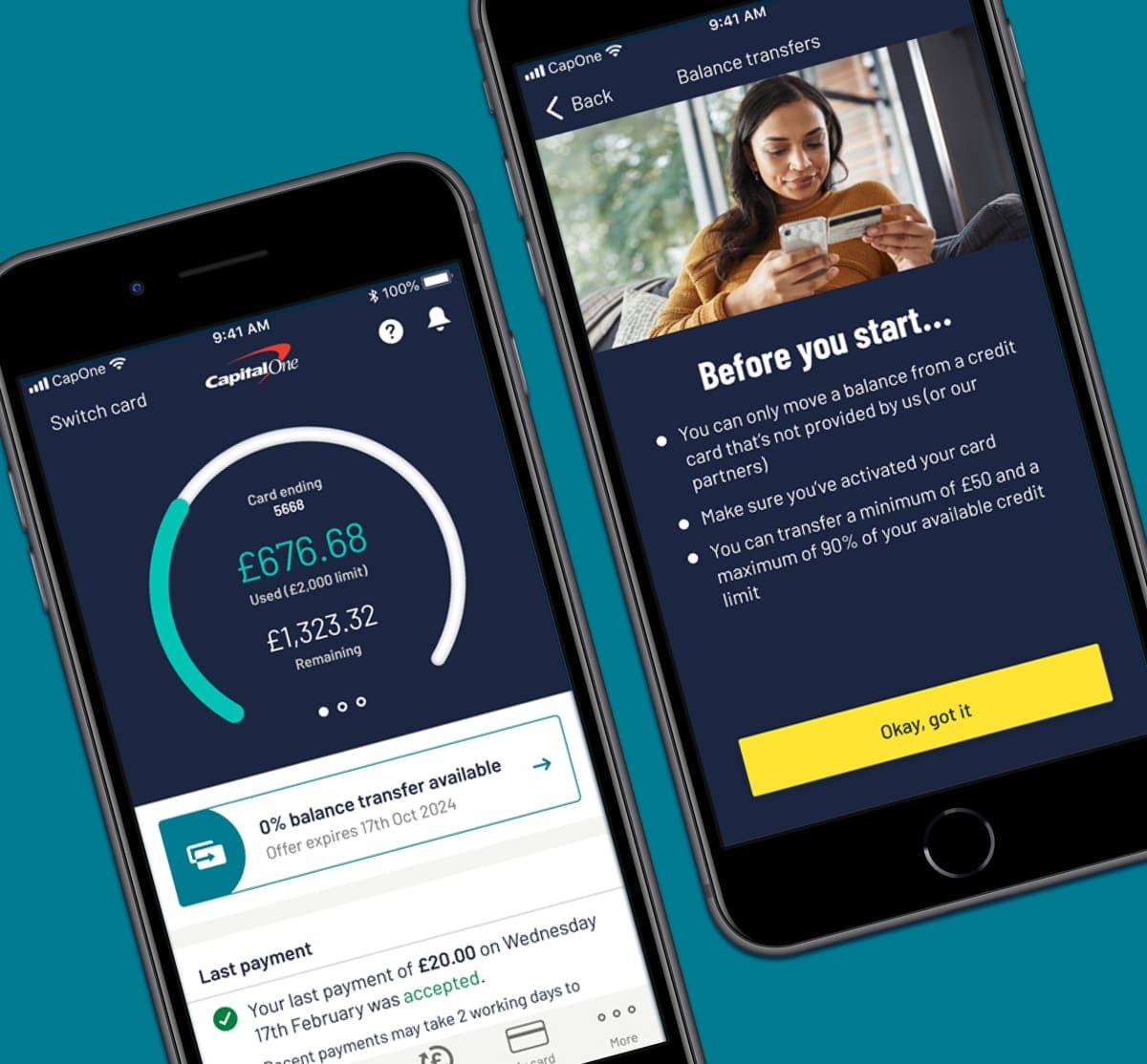
New customers could transfer a balance from other cards when applying for a new card. However, existing customers had to call and didn’t receive any transfer offers.
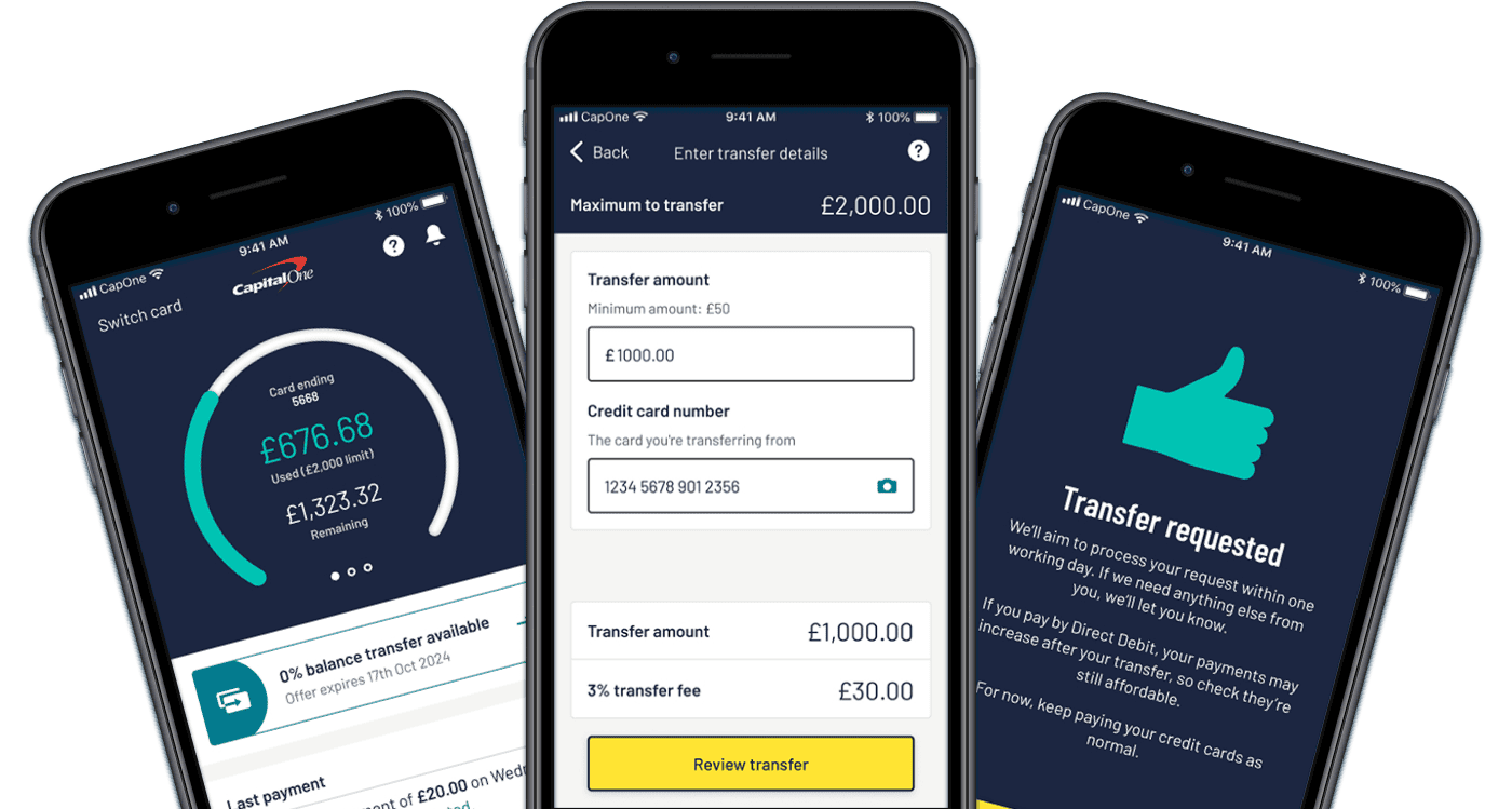
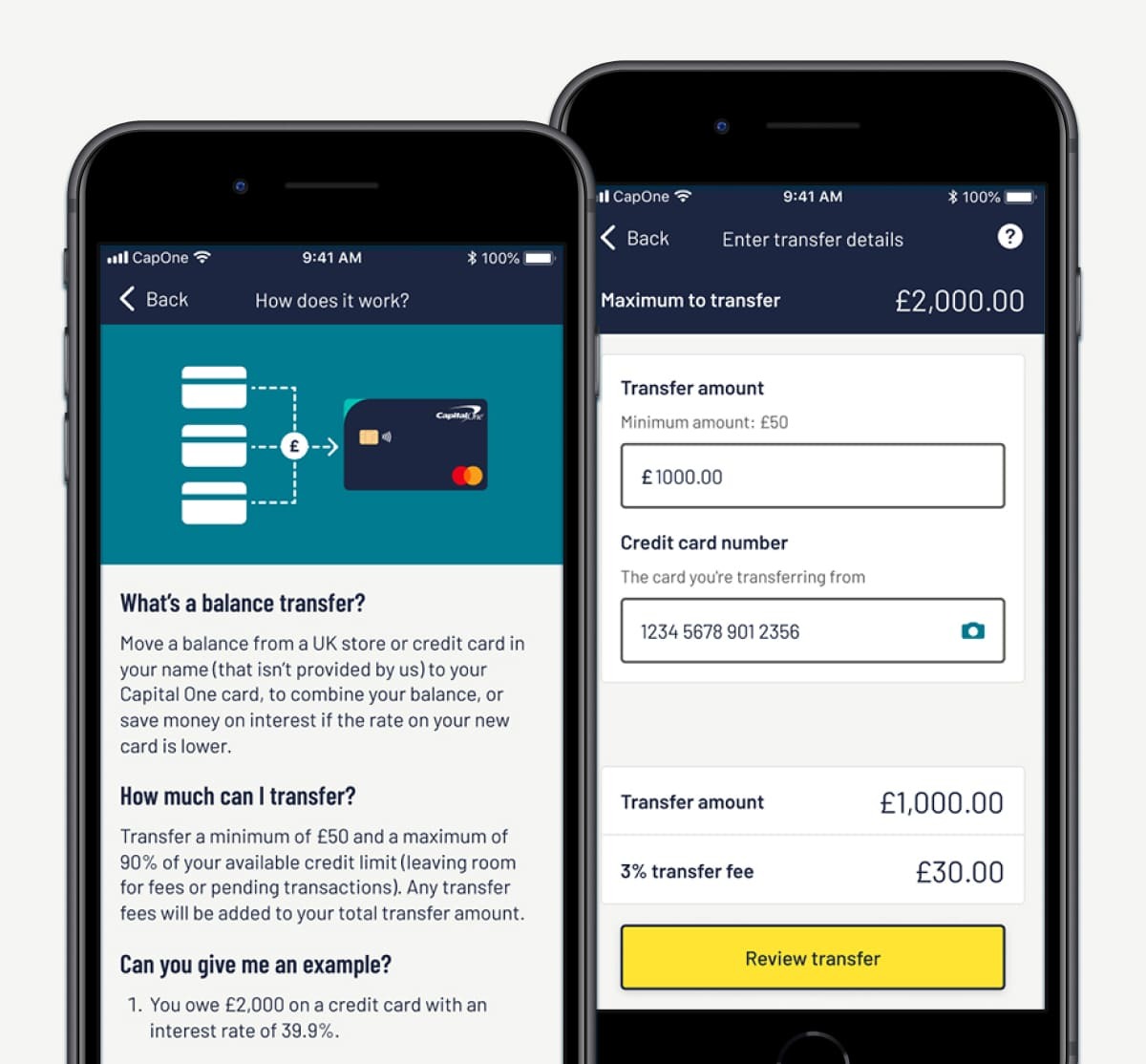
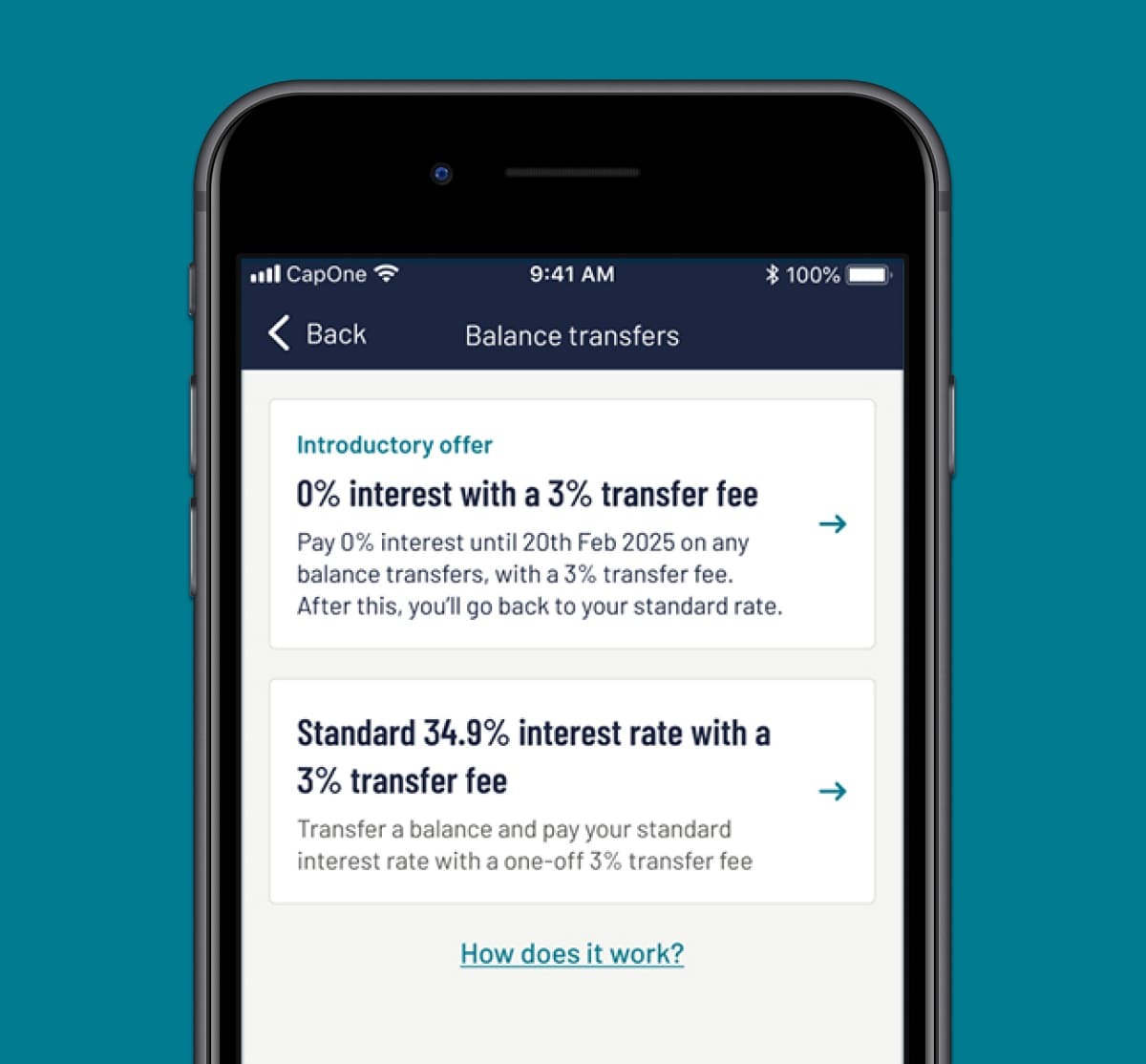
A new self-serve in-app feature that enables customers to transfer balances to Capital One, with more attractive transfer offers for eligible customers.

I led a user assumption mapping exercise with Tech, Product, and back-end servicing teams to identify our knowledge gaps regarding customer needs and business goals.
Together, we prioritised assumptions and outlined tasks to validate them, involving both customer research and internal discovery sprints to explore feasibility and technical capabilities.
To gain a clearer understanding of the market, I conducted competitor analysis on existing balance transfer journeys for inspiration and discovered themes and UI patterns.
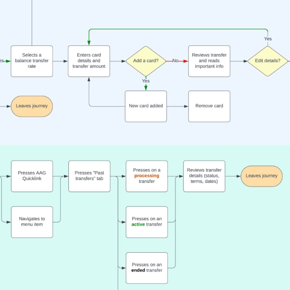
I also facilitated a user journey flow workshop to define the backbone of our journey and detail end-to-end flows. This allowed us to discuss and prioritise features, user stories, and knowledge gaps to establish the foundation for our minimum viable product (MVP).
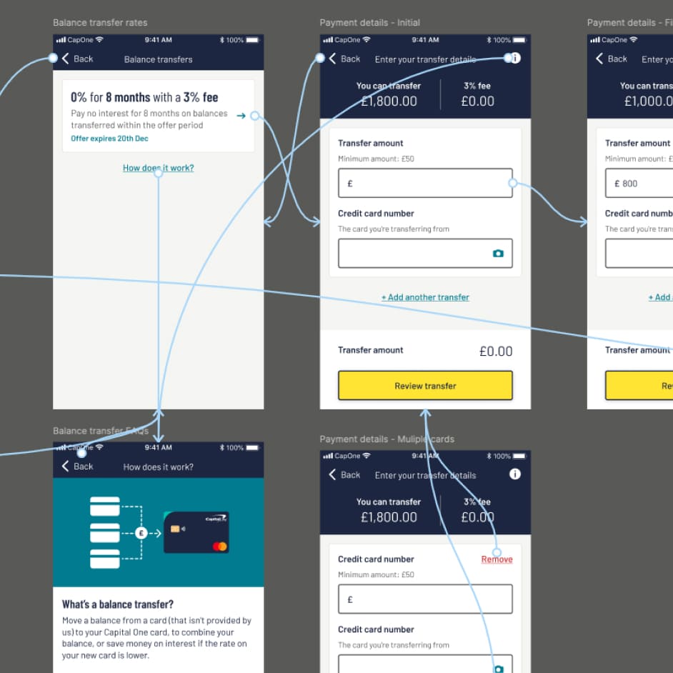
With a better grasp of the journey and features, I created low-fidelity wireframes, collaborating with Tech and Product for feedback and alignment. This allowed Tech to start development as I worked with the Research team on user testing, crafting interview guides and conducting sessions.
As designs progressed, I moved to high-fidelity UI, refining solutions to balance customer insights with business needs for a smooth handoff to Tech.
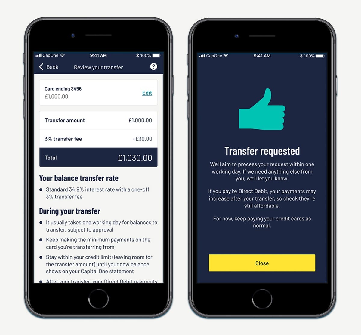
The app now enables customers to easily choose an attractive balance transfer offer, enter card details, and complete balance transfers from other cards. Since launch, the feature has generated thousands of requests, totaling millions in transferred balances to Capital One—boosting customer retention and enhancing experience.
Drop me a quick message to kick off the conversation, I'd love to explore how I can bring your product vision to life!